
Ceramic Tableware MOQ: Molds, Packaging & Price Breaks
Learn how ceramic tableware MOQ is determined by molds, production methods, glaze colors, decoration, packaging and quantity price breaks.
OEM vs ODM Ceramic Tableware: Which Model Is Right for Your Brand
Compare OEM and ODM ceramic tableware by design control, molds, MOQ, cost, lead time, IP, quality control and the best fit for your brand.
B2B Ceramic Plate Sizing Standards for Custom Dinnerware Manufacturing
A B2B guide to ceramic plate dimensions, manufacturing tolerances, firing shrinkage, stackability, packaging and custom dinnerware specifications.
Restaurant Dinnerware Testing: Durability & Commercial Washing
Restaurant-grade dinnerware is ware that meets a buyer-defined commercial-use specification. A credible approval combines repeatable impact and thermal tests, stable stacking, resistance to washing and staining, dimensional checks, food-contact evidence a
Interior Design Trends in Portugal for 2026: Colors, Materials & Ideas for Modern Homes
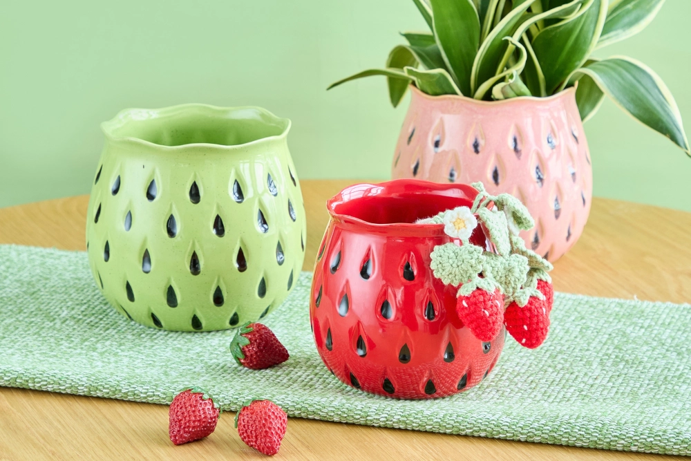
Portugal-focused design coverage for 2026 points toward warmer, more tactile and more personal rooms, but no single look represents every Portuguese home. The clearest local signals are warm minimalism, earthy color, natural materials, biophilic thinking and interiors shaped around everyday use.
Portugal gives these signals a distinctive setting: bright light, varied architecture, stone, wood and a long decorative ceramic tradition. This guide pairs practical styling ideas for homeowners with the decisions that home-decor brands and retailers face when translating a trend into a ceramic assortment for the Portuguese market.
Quick view: Across the Portugal-focused 2026 coverage reviewed, recurring signals include warm minimalism, earthy color, natural materials, biophilic thinking and more personal, functional rooms. Organic silhouettes, curated maximalism and longer-lasting design are broader 2026 directions that can suit Portuguese interiors when they respect local architecture, materials and cultural context.
Warm Earthy Colors Bring More Depth to Neutral Rooms
Portugal-based renovation coverage in 2026 specifically highlights warm minimalism and palettes built around earth, clay, terracotta, sage and toasted beige. That is stronger local evidence than treating every warm color as a universal Portuguese preference. Soft white can still keep a room bright, while ceramics, timber and textiles introduce warmth without flattening the interior into one tone.
At home, start with one quiet base and repeat a stronger shade in only a few places—a vase, textile or bowl. See this Portugal-based warm minimalism overview for the local context.
For a retail ceramic range, the useful translation is a coordinated palette rather than a large color count: one dependable warm neutral, one earth or clay family and one selective accent such as sage. Decide the core palette before multiplying shapes or seasonal SKUs, and check glaze samples in both daylight and warm artificial light.
Natural materials and handmade textures add depth
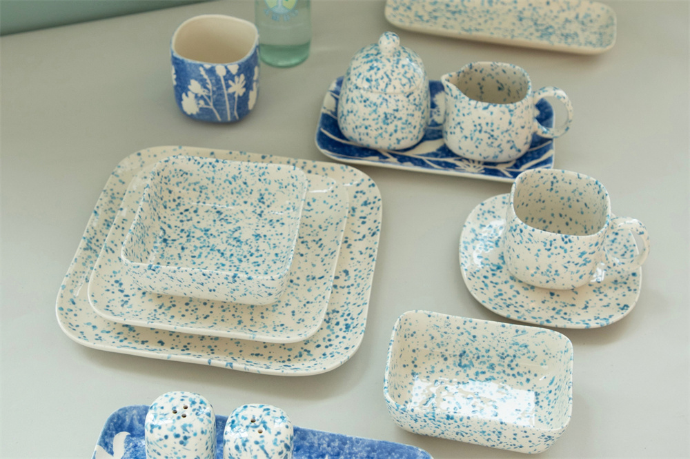
Portugal-focused 2026 interiors coverage gives natural materials, tactile surfaces and biophilic connections a clear local basis. Wood, linen, stone and woven fibers gain depth from contrast; ceramic can join that language through matte, speckled, carved, reactive or exposed-clay surfaces without forcing every object to look rustic.
For product selection, distinguish a handmade look from a confirmed handmade process. Textured molds, reactive glazes, speckled finishes, exposed clay and hand-painted details create different variation and control requirements. At JOYYE, we recommend defining the acceptable visual range before sampling a coordinated assortment instead of using “artisanal” as a vague style claim.
In a home, one matte or softly reactive ceramic surface is often enough to connect smooth stone with coarser linen or timber. For brands, the finish is also a quality decision: document where variation is welcome, where color matching matters and which surfaces must remain consistent across related SKUs.
Our guide to natural materials in home decor covers the wider material-planning topic, while our ceramic finishes guide explains how finish choices affect appearance, variation and product development.
Biophilic design moves beyond adding plants
Portugal-based interiors coverage for 2026 treats biophilic design as more than adding plants: daylight, natural materials, outdoor connection and colors drawn from nature all contribute. In a Portuguese apartment, the simplest move may be to keep a window line clear and add one well-scaled planter or vase rather than filling the room with greenery.
Useful ceramic categories include planters for living plants, vases for seasonal branches, organic bowls that echo natural forms and botanical decoration only when it has a clear role in the range. The choice should follow function: drainage and water protection for planting, stability for tall arrangements and low profiles for dining tables.
For retailers, biophilic styling works best as a focused cross-category story rather than a pile of plant-themed products. A planter, vase and one complementary bowl can share a glaze or curve while serving different rooms and uses.
For detailed flower-and-vessel styling, see JOYYE’s guide to flowers and ceramics in Portuguese home decor.
Organic shapes turn useful objects into focal points
Organic and curved forms are a broader 2026 design signal rather than a Portugal-only finding, although Lisbon Design Week provides local examples of sculptural form, material sensitivity and work rooted in Portuguese materials and landscape. At home, use scale and stability as the test: the object should soften the architecture without obstructing circulation, storage or conversation.
A brand does not need to make every piece highly sculptural. A more usable collection can start with one hero vase, bowl or candle holder, then carry one curve or finish into simpler supporting forms. That creates recognition without sacrificing stackability, packing efficiency or everyday function.
For consumers, measure the available surface and clear height before choosing an oversized form. For buyers, confirm the hero silhouette first, then decide which supporting SKUs should repeat its curve, proportion or finish.
See this Lisbon Design Week coverage for local design context, then browse ceramic vases and planters or ceramic candle holders for form and scale references.
Warm minimalism and curated maximalism can coexist
Warm minimalism has direct support in Portugal-focused 2026 coverage. Curated maximalism is better treated as a broader 2026 signal: richer color, pattern and collected objects can work in Portuguese interiors, but it is not evidence that the whole market is moving in one direction. Both approaches depend on a clear visual hierarchy.
For a restrained room, repeat one ceramic finish across two or three forms. For a more expressive room, keep the background quieter and vary pattern scale within one color family. Broader professional design reporting for 2026 supports the return of personality and expressive layering, but the application still needs to fit the specific home.
Retailers can tell both stories with one architecture: a core neutral range, a stronger accent SKU, a controlled palette and a pattern hierarchy. The difference comes from merchandising and SKU emphasis, not necessarily from developing two unrelated collections.
Portuguese ceramic traditions gain contemporary interpretations
Portugal’s official tourism guidance describes azulejo as a characteristic decorative art with a history visible across architecture and public spaces. That is the cultural evidence. A contemporary ceramic collection may respond to color, motif, rhythm or repetition, but it should not present a generic blue-and-white product as Portuguese heritage.
Blue and white is one route, not the only route. A geometric motif, repeated border or selective hand-painted accent can create rhythm beside contemporary furniture and natural wood. The key is to borrow a visual idea with care instead of claiming that one traditional pattern defines Portuguese design in 2026.
For brands, separate motif, color, rhythm and craft reference before development. Use only what the design brief can justify, verify the reference and avoid a broad “Portuguese style” claim. JOYYE products shown here are visual examples of palette and composition only; they are not evidence of Portuguese heritage or a documented azulejo-inspired origin.
Read the cultural background from Visit Portugal’s guide to Portuguese tiles.
Long lasting design matters more than trend turnover
Longer-lasting design is a broader 2026 professional direction rather than an exclusively Portuguese trend. The practical principle is sound in any market: durable materials, useful shapes and finishes that work with more than one palette can remain relevant after a seasonal color changes.
This is where brands need precise language. Natural-looking does not automatically mean sustainable, and a handmade appearance does not prove a handmade process. JOYYE can help customers review material, finish, decoration and quality requirements during development, but environmental or craft claims should be used only when product-specific evidence supports them.
For homeowners, longevity begins with fit: the object should suit the room, intended use and care routine. For brands, it also means repeatable specifications, packaging that protects projecting rims or handles, and colors that can coordinate with future additions. Clear material information and realistic performance expectations are more useful than broad lifestyle language.
Functional and personal spaces lead the 2026 mood
Portugal-based 2026 interiors coverage also emphasizes rooms that feel authentic, personal and workable in daily life. A mug should be pleasant to hold, a bowl should earn its place on the table and a decorative object should not obstruct storage or movement. Personal character comes from useful choices and meaningful objects, not from filling every surface.
Ceramics bridge function and decoration particularly well. A mug can live on an open shelf, a serving bowl can move from kitchen to dining table and a vase can stand alone between arrangements. For retailers, that creates a credible cross-category opportunity across tabletop, kitchen, dining, living and decorative ranges.
The collection does not need to be an identical matching set. A repeated color, curve or finish can connect functional and decorative categories while allowing each product to meet its own use requirements.
How to apply the trends room by room
| Space | Ceramic starting point | Styling decision |
| Living room | One statement vase or sculptural candle holder | Match the scale to the console shelf or coffee table |
| Dining room | Dinnerware bowls and a low centerpiece | Keep sightlines clear and repeat one color from the room |
| Bedroom | Small vase lidded jar or quiet accessory | Use softer finishes and leave visual space around the object |
| Entryway | Stable vase bowl or grouped candle holders | Choose one focal point and allow practical space for keys or bags |
Use the table as a starting point, then ask what the space must do, which existing color or material the new object should connect with, and how much visual weight the surface can carry. The aim is not to apply every trend in every room.
A small change works best when it connects to an existing color, curve or material and still leaves the room easy to use.
Explore JOYYE’s tableware collections and ceramic mug collections for practical cross-room assortment ideas.
What the trends mean for home decor brands and retailers
For buyers, the commercial opportunity is not to copy every look. It is to translate a credible signal into a collection for a defined customer and sales channel. Start with the target customer and hero category, then set the palette, shape family and finish that will hold the range together. One accent pattern or sculptural form can lead the story.
A seasonal refresh may use new color, decoration or packaging around proven forms; a signature collection may justify new shapes and deeper development. At JOYYE, we use the brief to connect the trend signal with ceramic bodies, glaze direction, decoration, supporting SKUs, packaging and merchandising context. Final options still depend on quantity, timing, technical feasibility and the approved specification.
Before sampling, confirm the target customer, price position, sales channel, hero category, supporting products, core palette, acceptable finish variation and packaging context. This sequence turns a mood board into buyer decisions. It also helps us determine whether an existing form can be adapted through glaze or decoration, or whether the concept calls for new shape development.
| Trend signal | Ceramic product opportunity | Buyer decision |
| Warm earth tones | Matte or reactive coordinated glaze family | Set the core palette before multiplying colors |
| Organic forms | Hero vase, bowl or candle holder with simpler support pieces | Choose one lead silhouette and repeat a curve or finish |
| Natural texture | Matte, speckled, exposed-clay or controlled reactive effects | Define acceptable variation before sampling |
| Pattern or cultural reference | Selective border or hand-painted accent | Verify the reference and avoid broad cultural claims |
Our OEM and ODM ceramic manufacturing guide explains when to adapt an existing platform and when to invest in a proprietary design.
Translate Portugal’s 2026 Design Trends into a Ceramic Collection
For brands and retailers, the most useful 2026 signals are the ones that can be translated into a coherent collection without losing sight of function, local context or long-term relevance. Warm color, natural texture, greenery, organic forms and edited pattern all work best as choices, not rules.
Ceramic decor supports that gradual approach. One vessel, candle holder or tableware group can change a room’s color, texture and rhythm, then move as the home evolves. If you are developing a Portugal-focused ceramic collection, share your audience, price position, sales channel, preferred categories and colors, estimated quantity range, launch window and preferred depth of customization.
Discuss a Portugal-focused ceramic collection
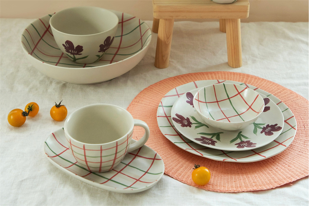 Ceramic Tableware MOQ: Molds, Packaging & Price Breaks
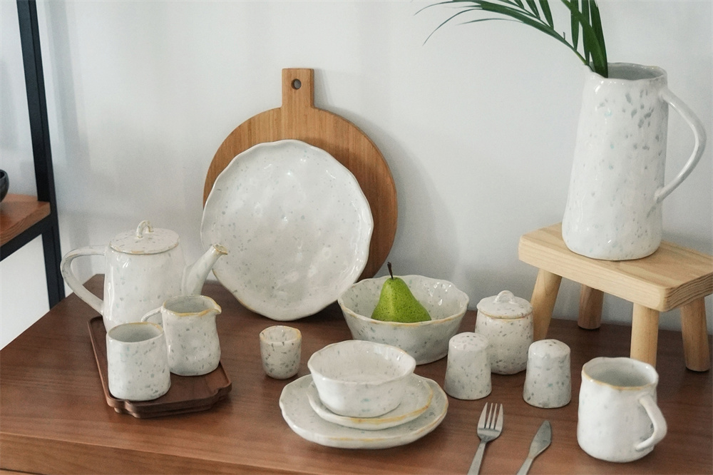 OEM vs ODM Ceramic Tableware: Which Model Is Right for Your Brand
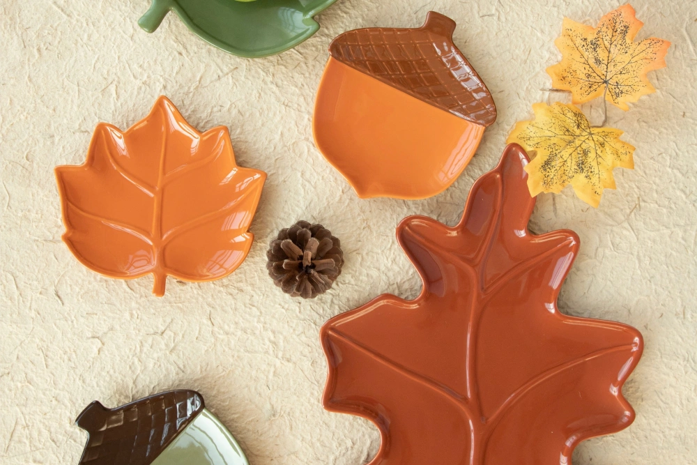 B2B Ceramic Plate Sizing Standards for Custom Dinnerware Manufacturing
 Restaurant Dinnerware Testing: Durability & Commercial Washing